Pro sports’ spooky, scary jerseys will send shivers down your spine
By Sajan Jabbal, Staff Writer and Dan Khavkin, Sports Editor
In honour of Halloween, the Reflector presents some scary uniforms that will haunt your eyes with their ugliness keeping you up at night.
Where’s Waldo

Montreal Canadiens heritage jerseys. Photo courtesy of all-habs.net
In 2009, the Montreal Canadiens were celebrating their 100 year anniversary and is known as the most historic club in the NHL. They decided to bring back a jersey which they used almost 100 years ago and it was horrific.
The jersey itself follows the traditional Habs colours, but the horizontal stripes are just hard to look at, and instead of watching a hockey game, the fans have to deal with playing a game of Where’s Waldo.
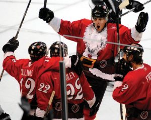
Hockey’s bird flu

Chris Thorburn #27 of the Atlanta Thrashers against the Dallas Stars at Philips Arena on December 17, 2009 in Atlanta, Georgia. Jersey used from 1999-2011. Photo courtesy of Kevin C. Cox/Getty Images from Bleacher Report
The Atlanta Thrashers had a short tenure in the NHL, from 1999-2011, which nobody was surprised about because nobody plays or watches hockey in Georgia. Nevertheless, the team continued on with terrible jerseys every year.
Instead of a classic logo on the front of the jersey, the Thrashers decided to put their numbers instead, which isn’t something you usually see and makes it kind of look like a football jersey. The colour scheme does not match at all and the sides of the jersey are horribly designed. Not to mention the birds on their shoulders. Luckily, extinction did find these birds.
Santa on ice … minus a few teeth
Las Vegas Wranglers holiday jerseys. Photo courtesy of Icethetics
The Las Vegas Wranglers were once a farm team to the NHLâs Arizona (then Phoenix) Coyotes and rocked these holiday themed sweaters. Imagine having five Santas with hockey sticks on the ice charging at you at full speed… Let’s just say that’s not on our Christmas list this year.
Scare-no’s

Topeka Scarecrows jersey. Photo courtesy of webshots.com
Former CHL’s (very ex-minor pro hockey league) Topeka Scarecrows rocked these Halloween-themed jerseys. Like the team that folded just a few years into existence, they do not look good on ice. The logo looks straight out of a Halloween Scooby-Doo special. Although creative, this is one scarecrow that deserves to be beaten with a stick.
A very bright and colourful, brick wall

Jorge Campos’s various jerseys. Photo courtesy of Sports Illustrated
Mexican national goalkeeper Jorge Campos suited up 130 times for his home nation. He may have had amazing shot-stopping abilities but his fashion sense was very questionable. Campos explains his origins and how they were motivation to the flamboyant look:
“The beach, surfing — I didn’t get to the ocean every day [growing up] . . . But every weekend? Definitely. So I was thinking: If I can’t surf anymore, I’ll bring the style, the shore, the coloring, to soccer,” he says in an interview with Sports Illustrated.
Rated-Arr
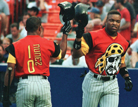
Pittsburgh Pirates 1999 jerseys. Photo courtesy of Sports Illustrated
The 1999 Pittsburgh Pirates had an abysmal season and somehow, someway, the jerseys must have had something to do with it. Peep how the face on the right is matching the expression of the logo. Let’s be honest, that is really all of our faces when we see these atrocities on the diamond. This was one of baseball’s most horrendous eyesores and thankfully, the Pirates scrapped these a short while after.
‘U of’ don’t want to C that

Calgary Dinos 2017 jerseys. Photo courtesy of Justin Quaintance
Yes, the University of Calgary Dinos may have won the 2017 Crowchild Classic, but these cheap E.T. knockoffs were painful to look at for a full 60 minutes plus overtime. On one hand, it was sad to see MRU lose an overtime game, especially on that stage, but thankfully the game ended so we never have to be forced to stare at the mustard coloured atrocities ever again.